
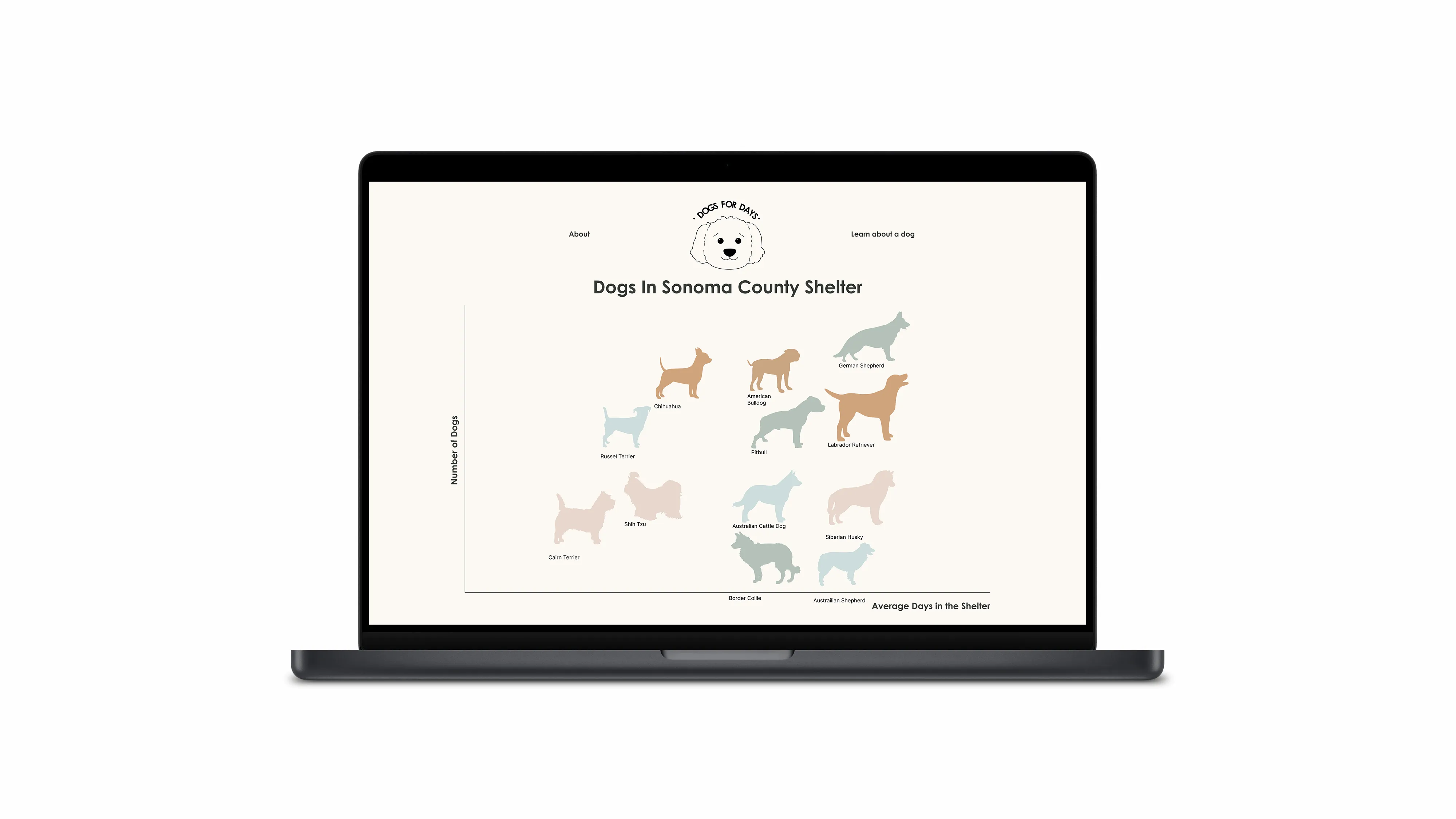
A live, interactive data visualization of the top few dog breeds in the Sonoma County Shelter
4 weeks
Team
Haiyeng - Project manager, UX designer, Coder
Alyssa Suba - Researcher
Tessa Board - UX writer, Documentarian
How might we encourage more people to adopt pets from animal shelters instead of purchasing from breeders, in order to reduce the number of pets being euthanized?
Our goal was to use data visualization to help increase adoption, and to show people the type of dogs available and have them reconsider adopting instead of buying.
1. Wanted a certain breed
2. Shelters were closing due to COVID
3. Had to rehome a relative's dog
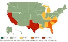
No-Kill 2025 is an initiative by Best Friends that was started in 2016. Their goal is to have shelters in the United States achieve no-kill by 2025. They created a pet lifesaving dashboard consisting of a United States map. Each state is colored based on priority, with the highest priority states having the largest non-“non-kill” shelters. Users interact with the map by hovering over each state to view their shelter statistics. The statistics include pets entered into animal shelters, saved, killed, number of animal shelters and no-kill shelters, and percentage of animal shelters reporting.
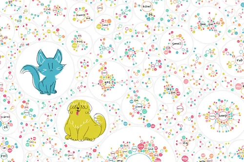
This portfolio has many data visualizations. We were interested in the “Why Do Cats and Dogs..?” visualization as the topic relates to ours. The design is fun, and colorful, and allows user input. We were inspired by this design and used it in one of our sketches. However, since this design isn’t the best way to display our ideas, we decided to try a different approach.
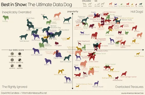
We were able to take inspiration from the design of this data set. We wanted to use drawings of dogs to connect with our users. Visuals that display an actual image of what the data is about will help users connect with the given information. We were able to tweak the design to help our potential users gather essential information about what dogs are available and at what rate those dogs are available.
1. It uses live data taken from Sonoma County Shelter
2. It is interactive and shows several data categories

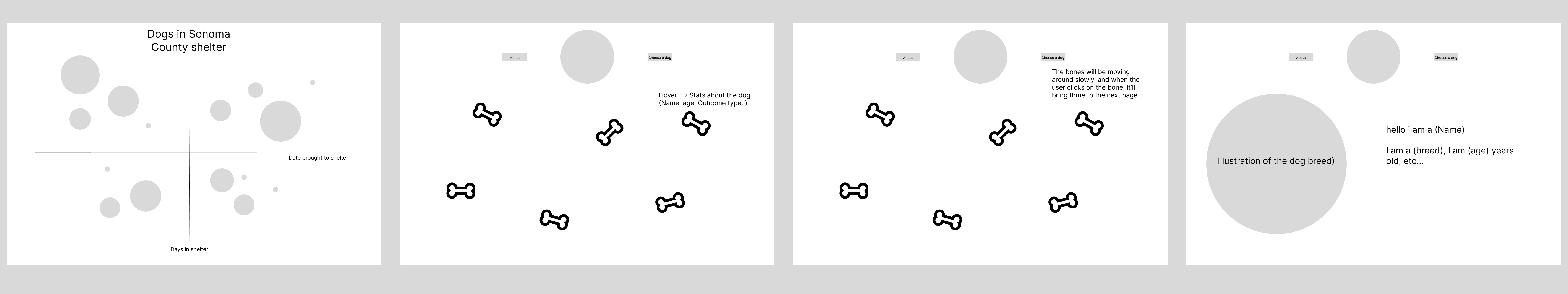
We first came up with a list of important information that new pet owners would like to know, and what had to be visualized
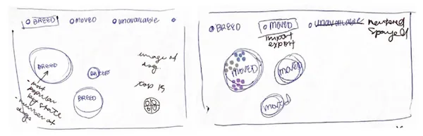
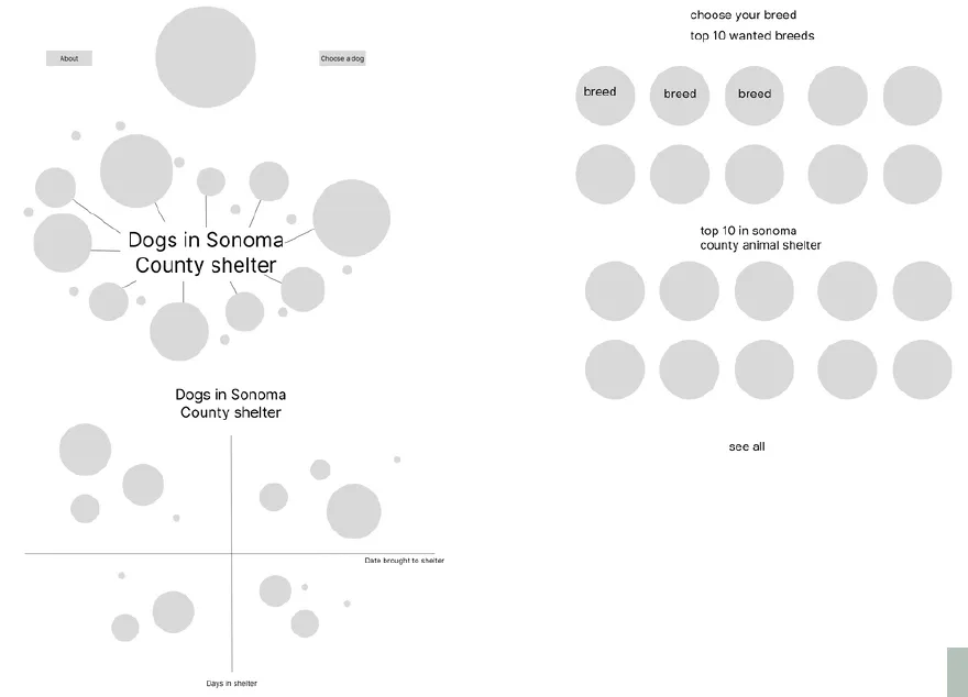
During the next round of iteration, the team decided to create the designs individually. We then discussed the designs as a group to finalize our first prototype design..
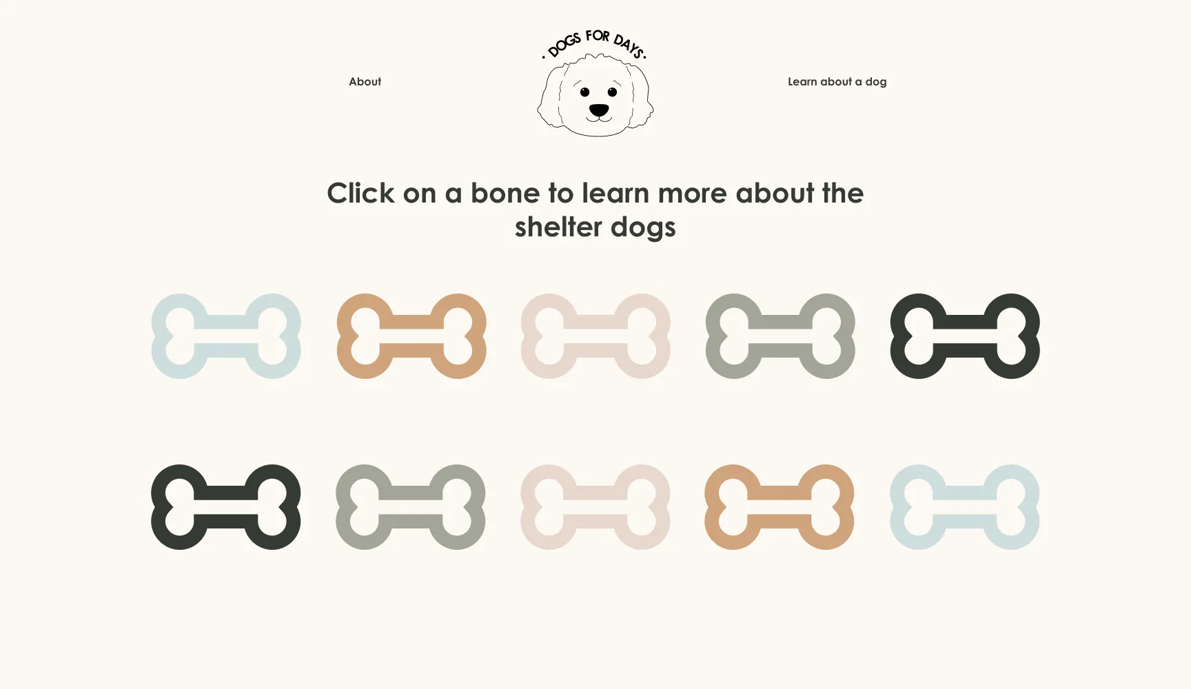
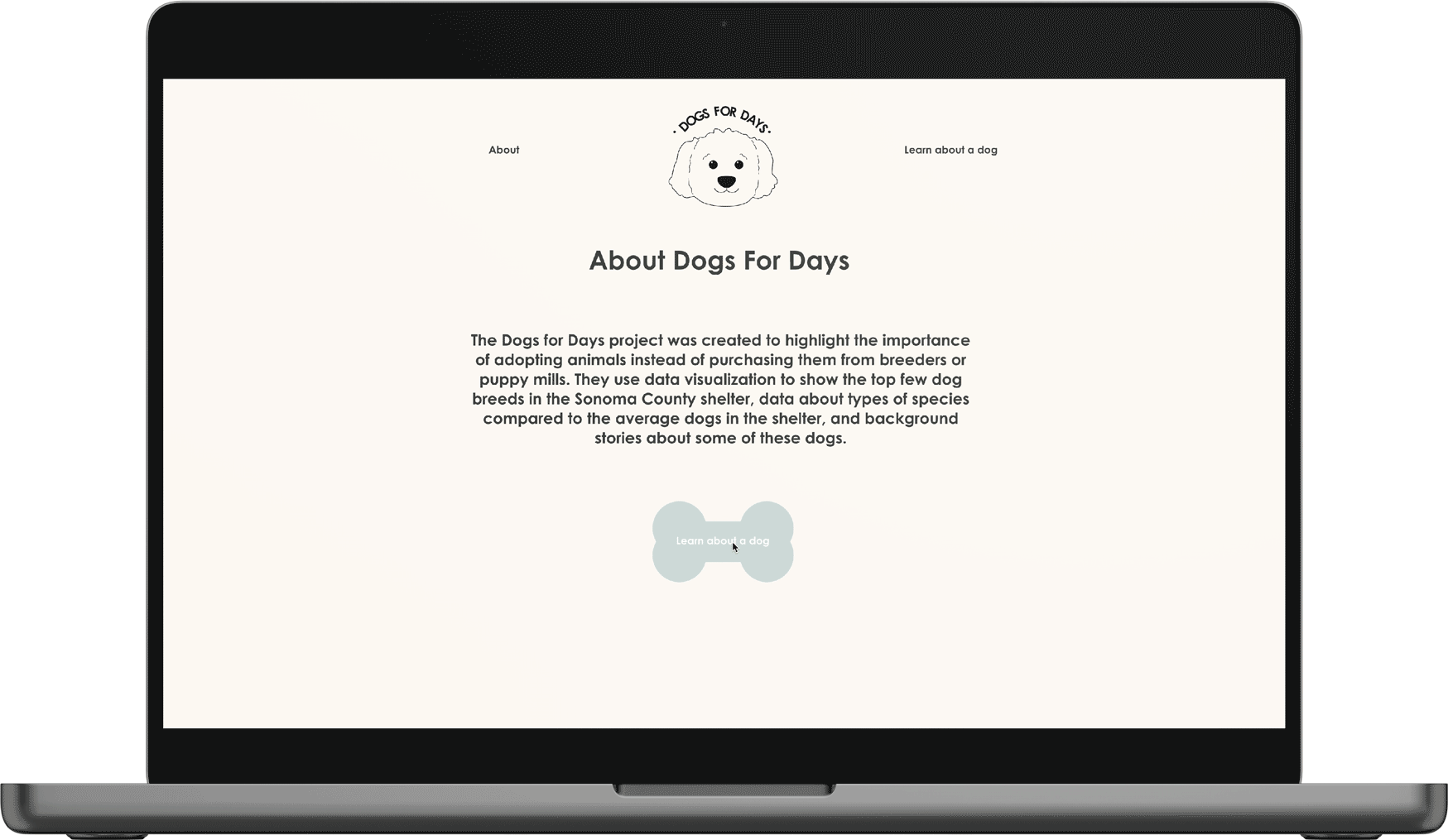
Some of these ideas can be seen in our final design. Due to limited time and resources, we were unable to code the moving dog bone feature. Instead, we made it a static button with little information to create a sense of mystery.
Users were able to complete the tasks that were given to them
Users were able to interact and look at the data
They thought that it was cute, and engaging
Users were clicking on the "Learn more" button instead of the arrow
They wanted to be able to see the dog stats when they hover over the charts
The websit didn't have a back button
We were able to create an MVP of this data visualization of dogs in the shelter. We took the API from the shelter's website, and embed it to our code.
We realized that most dogs who appeared in shelters were lost dogs and were returned to their owners. For most dog breeds, this was the outcome for 1/4 to 3/4 of those that appeared in the shelter.
A lot more dogs were transferred than adopted or euthanized. Therefore, it is difficult to anticipate the final outcome of the dog
Having the numbers auto populate using the API
1. Change some charts to better present the data
2. Include more animals
3. Remove information that is irrelevant to adoption rates